Anamorphic maps are a unique way of visualizing spatial data. In contrast to traditional maps, which prioritize accuracy in representing shapes and distances, anamorphic maps intentionally distort the shapes of geographical areas to highlight specific features, such as population density or economic activity. This approach can provide a fresh perspective on familiar geographic features and reveal new patterns and insights.
As part of my research, I study the effect of the evolution of train travel times on regional interactions in France. As the network expended, high-speed railways has allowed to substantially decrease train travel times between cities over the years, leading to a shift in our perception of distance. In this post, using our unique train travel time dataset (Gambuli and Stipanicic, forthcoming) and employing anamorphic techniques, I illustrate this great distortion of the relationship between space and time.
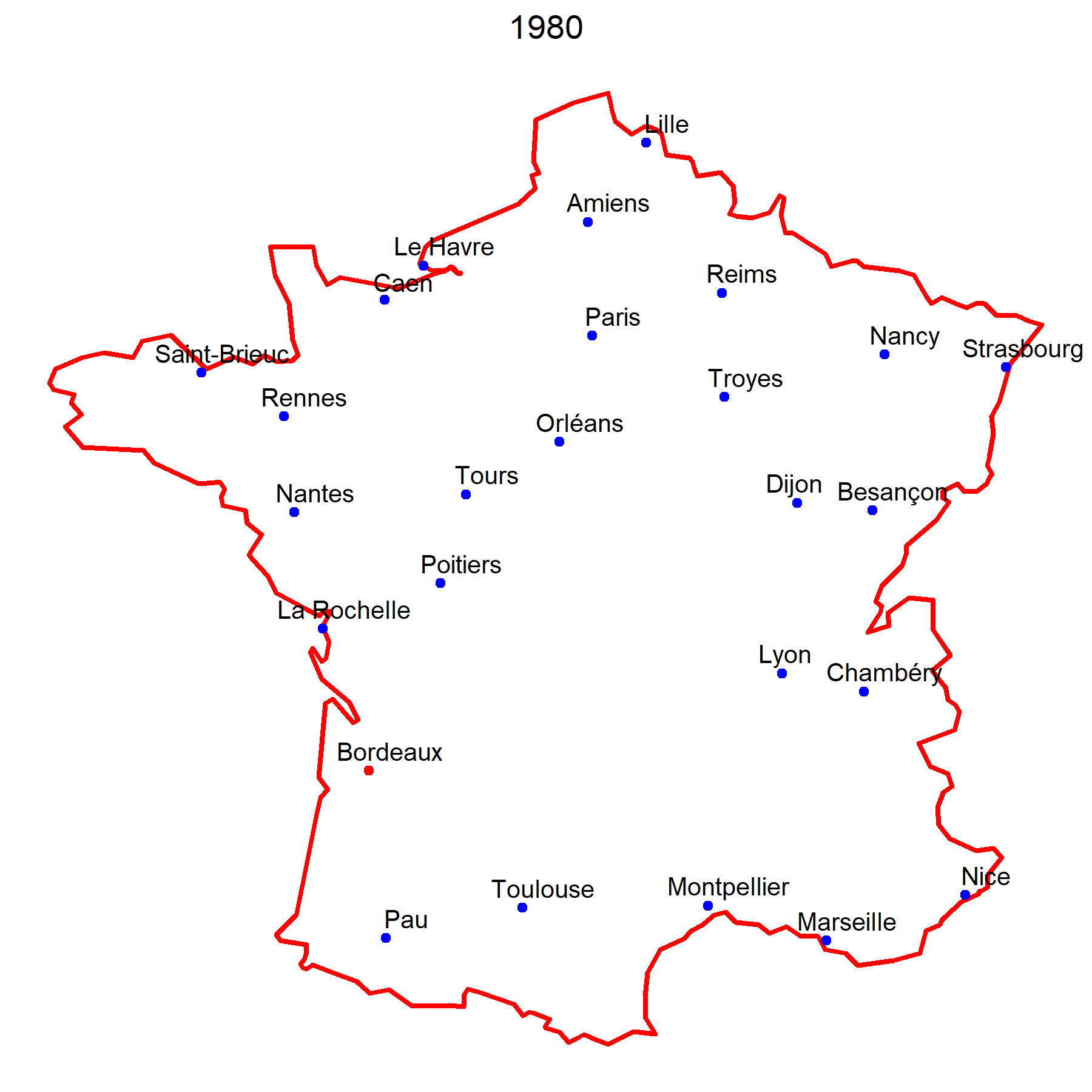
Train Travel Time from Paris
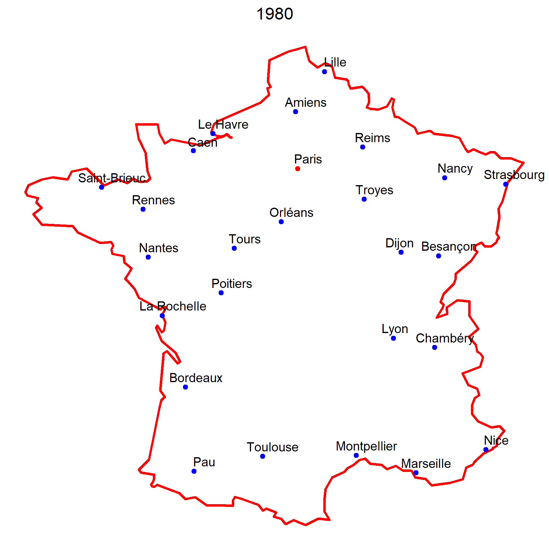
To create an anamorphic map reflecting alterations in distances corresponding to changes in travel time, we need to identify a fixed point, in this case, let's consider Paris, and other points, other big cities, within the spatial polygon of France. Additionally, we need to define a reference year, 1980, before the first high-speed rail roll-out. The shape of France and the positioning of cities in relation to Paris are going to be normalized based on travel time to Paris in 1980. This standardization serves as the benchmark for comparing travel times in subsequent years.
The goal is to depict the gradual convergence of cities toward Paris as high-speed railways expand. This involves deriving updated coordinates for each city after each high-speed rail rollout. To achieve this, I calculate the travel time ratio for year t relative to the baseline year 1980, serving as a scaling factor for distances between Paris and other cities. Simultaneously, I determine the bearing for each city, representing the direction from Paris as an angle measured from the north. By multiplying the original distance between Paris and each city by the travel time ratio and adjusting the bearing, I obtain the new coordinates following high-speed rail implementation.
The final step involves plotting the distorted map of France using these updated coordinates for each city, along with all the points outlining national borders. The resulting maps depict the evolving spatial connections between Paris and major cities in France, illustrating the alterations in perceived distances driven by changes in travel time over the years.
Discover above how the French high-speed railway has improved travel time from Paris to other cities between 1980 and 2020, and see cities that have become more accessible. Below, you will also find maps from the perspectives of Lyon and Bordeaux.
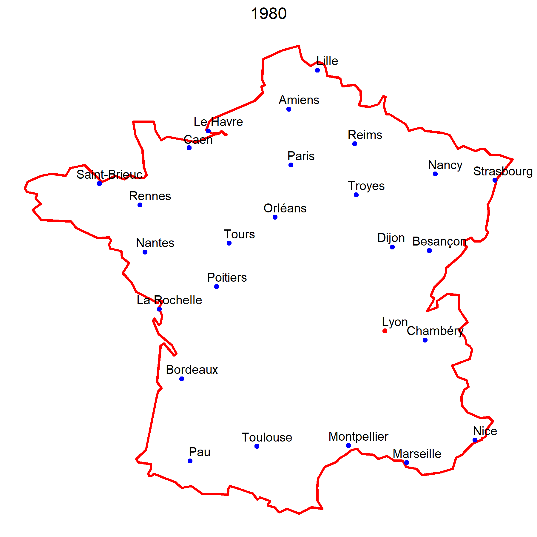
Train Travel Time from Lyon
Train Travel Time from Bordeaux